
Academics / Dissertation / Results
What picturesreally mean in biomedicine
How the images on biomedical innovation web pages make arguments of their own, and whom they are meant to reach.
- From My doctoral dissertation, results chapters
- Method Grounded theory, three sources coded together
- Quotations Checked word for word against the dissertation
Results
What I found
Why pictures carry so much weight here
Surveys and interviews gave me words. The innovation pages of the organizations my interviewees named gave me pictures, made for a broad public and not produced for my study. I saved the top innovation page of each of 22 organizations, among them drug and device makers, technology companies, investment firms, a hospital, and public health agencies.
In biomedicine the pictures do extra work. Firms face strict limits on what the text of their marketing can say, and far fewer on the images. A recruitment poster for a clinical trial has its wording set by regulators but wide freedom in its visuals. A drug commercial can run positive imagery while the side effects scroll past, and the imagery is likely to sway the viewer. Images can make an argument with or without words.
To read them, I added a coding category for visual rhetoric. I sorted the images into people, places and facilities, and general scientific imagery, then coded who was pictured and what science was shown, borrowing categories from the text coding so the three sources could be compared.
“The content of web artifacts is unique from that of interview and survey data, which consist solely of text, in that they contain visual rhetoric which can be considered performative for a broad audience, not generated in response to the research.”
People looking up and ahead
Photographs of people appeared on 16 of the 22 pages, and more than half of those showed groups. Many showed people facing a screen, a microscope, or a scan. I coded these as orientational visual metaphors. Looking up and looking ahead carry optimism and a sense of control, so on a corporate innovation page they may suggest control over good business outcomes. Close-ups of scientists and clinicians often carried words about collaboration and the power of the individual.
Sport appeared too, with people running, racing, and doing yoga. This self-optimization imagery links innovation outcomes to competition, endurance, and flexibility, and it echoes the sports metaphors my interviewees used. Other images showed ordinary people using technology, a video call with family or a tablet showing health information. I read these as visual personification. The technology plays a part in a human scene, which helps a lay viewer picture the future a venture promises.
Science, but never the product
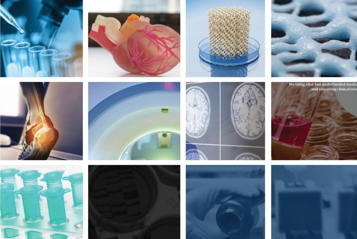
No corporate page I studied showed the firm's own technology. They showed general biology and chemistry instead, a polymer model of a heart, brain scans, vials, a reagent being poured. Policy talk has a similar habit, where naming a manufacturer's intellectual property is taboo.
I read the choice as an appeal to virtue. Basic science stands for the greater good, and borrowing its look places a firm's work in that light and away from any hint of self-interest. A young venture has to hold that virtue alongside the growth story it tells private investors.
“In many cases, biomedical and investment firms also face the challenge of strict limits on certain types of text content in their marketing materials, requirements set by national and local governments.”
Empty rooms and connected dots
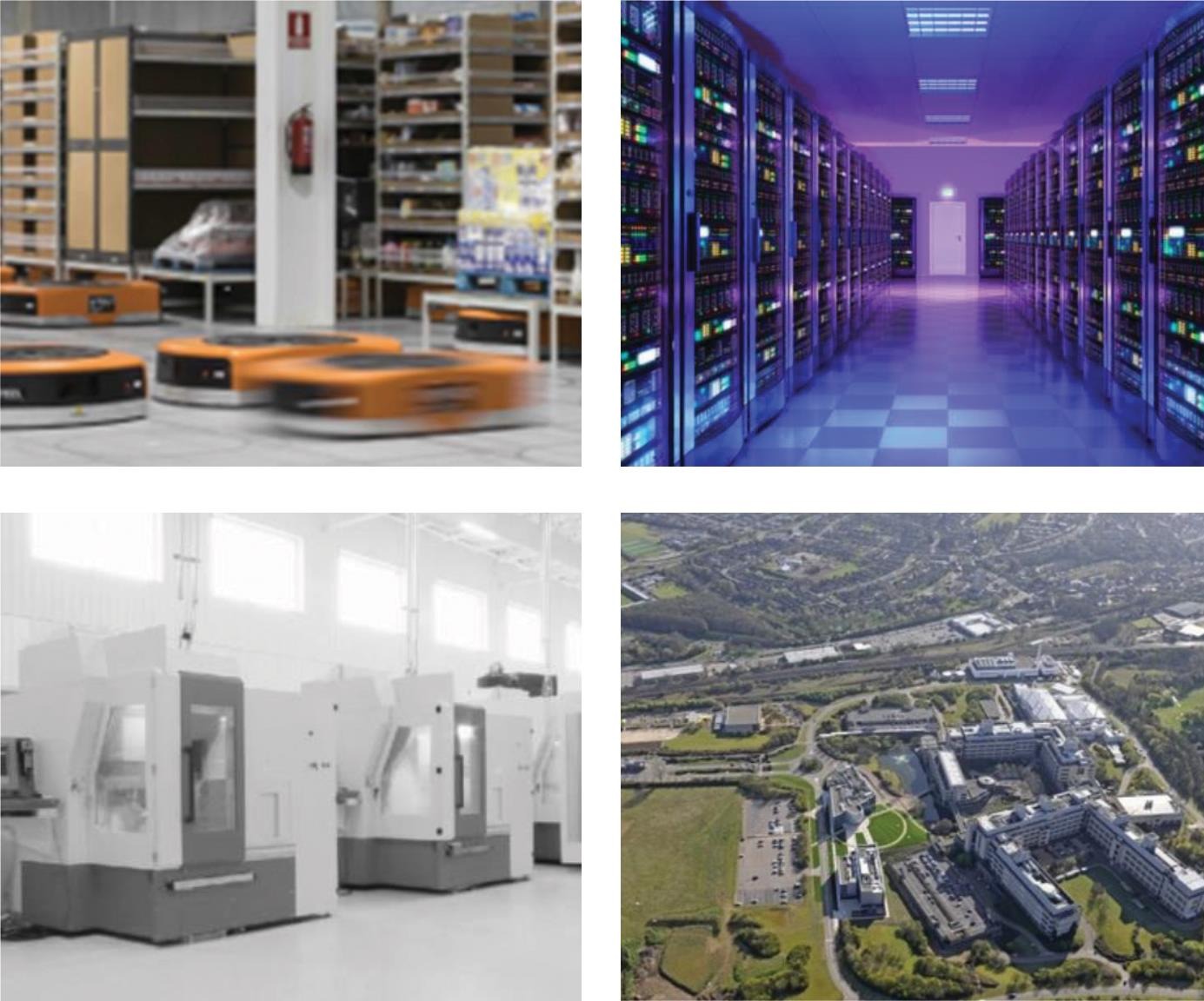
Where pages showed facilities, most were large, sterile, and empty, laboratories and server rooms with no one at work in them. I compare that emptiness to silence in a text. It leaves room for viewers to bring their own judgment, and technical viewers bring their own knowledge of what happens there. In the terms of space syntax, where the objects in a room make meaning the way words make a sentence, these silent facilities make room for very different audiences at once.
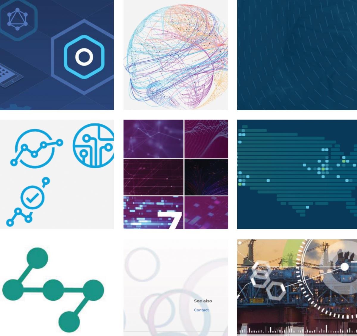
Abstract graphics were common too, composites of many parts in transparent colors, interconnected circles, and fields of dots. I read them as a visual metaphor of coming together, an idea our culture treats as virtuous, especially in science.
Investment firm pages carried prominent infographics of their experience by market segment and stage. These establish authority and set the frame for talks with the companies they might fund. Entrepreneurs who cannot recognize the type of investment firm in front of them are much less likely to exchange knowledge with it effectively.
Why the agency pages are all text
The innovation pages of the public health agencies and the international standards body had none of this. They showed no people and no laboratories, used few colors, and kept abstract art to a minimum. Only one corporate page and one hospital page looked the same way, as bulleted text.
I read that plainness as a choice of audience. Corporate sites commonly tailor pages by region and widen their reach with culturally specific images. A text-only page speaks to biomedical professionals everywhere as one harmonized audience, and narrows its reach on purpose.
The categories
Eight kinds of picture
The examples are the words in my data, as I coded them.
-
Looking up and ahead
People turned toward screens, microscopes, and scans, an orientational image of a future they control.
- woman looking into the microscope
- a man looking into VR headset with visualization of brain
- a woman and a man doctor looking at the MRI images
-
Sport and fitness
Running, racing, and yoga, linking innovation to competition, endurance, and flexibility.
- a group of people running in what appears to be an endurance race setting
- doing what appears to be yoga in a home setting
- a man leaping across shallow salt flats filled with water
-
Technology in human hands
Ordinary people using technology in daily life, so the innovation takes a part in a human scene.
- non-scientist man looking at the tablet screen with family video chat
- a female hand holding tablet showing medical information
-
General science as virtue
Biology and chemistry in place of the firm's own product, borrowing the virtue of basic science.
- polymer model of a heart
- image of 3-D printed bone scaffolding
- image of MRI image slices of the brain
-
Silent facilities
Large, sterile, empty spaces that leave room for each viewer's own judgment.
- server rooms housing computer equipment
- an aerial image of facility
- robotics moving between shelves of a product stored
-
Coming together
Abstract composites, transparent circles, and fields of dots that picture many parts joining into one.
- interconnected transparent circles
- abstract image of technology hot spots on U.S. map
- hexagons layered over industrial skyline image
-
Appeals to experience
Investor infographics of segments and stages that establish authority and frame the conversation with a company.
- infographic about market segment and late phase (phase 3) experience
-
Text only
Agency pages with no people and no pictures, written for professionals everywhere as one audience.
- innovation page with no images, all text
Figures from the dissertation
What the pages actually showed
Six of the collages I made from the 22 innovation pages, as they appear in the dissertation. Organizations are described by kind.



In the dissertation’s words
Findings, quoted
-
“In the context of corporate innovation, the imagery of people looking forward and upwards may suggest control over positive, desirable business outcomes.”
p. 142
-
“Use of relatively general scientific imagery can be understood as a rhetorical move intended to emphasize the virtue of a firm’s innovation, and its connection to the virtuous roots in basic science and societal scientific advancement over business aims that may connotate self-interest or lack of virtue.”
p. 150
-
“As such, these silent facilities provide a unique form of space syntax in communications from biomedical venture and investment organizations that allows space for engagement with extremely varied general and technical audiences.”
p. 153
-
“Notably, both human and nonhuman imagery elements ubiquitous in corporate pharma/medtech and investment firm websites were absent from the innovation web pages of public health agencies.”
p. 156
Why it matters now
For the people who build and fund
Regulation limits what a biomedical company can say in words and leaves its pictures far freer, so the images do much of the work of explaining a venture to people without technical training. Reading them as closely as the text shows who a page is speaking to and what future it asks the viewer to believe in. A founder can read an investor's pages this way before the first meeting.
In the dissertation
More figures and tables
The figures listed here carry organizations’ names and logos, so they are not reproduced. They and the tables are in the full text, on the pages below.
- Figure 4.12 Sports Visual Metaphors in Innovation Web Artifacts Page 147
- Figure 4.17 Visual Rhetoric of Public Health Agency Websites Page 157
- Figure 5.9 Visual Rhetoric of Collaborative Participation in Corporate Websites Page 199
- Figure 5.12 Visual Rhetoric of Investment Firms with Appeals to Experience (ethos) to Establish Credibility Page 208
- Figure 5.14 Visual Rhetoric of Bridging Clinical-Corporate Interface Corporate Websites Page 218
- Table 4.7 Focused Coding of Web Artifact Data (N = 22) Page 141
- Table 4.6 Innovation Webpage Artifacts by Corporation and Industry Segment (N = 22) Page 140
Full text at Texas Tech Metaphors in innovation Back to teaching and philosophy